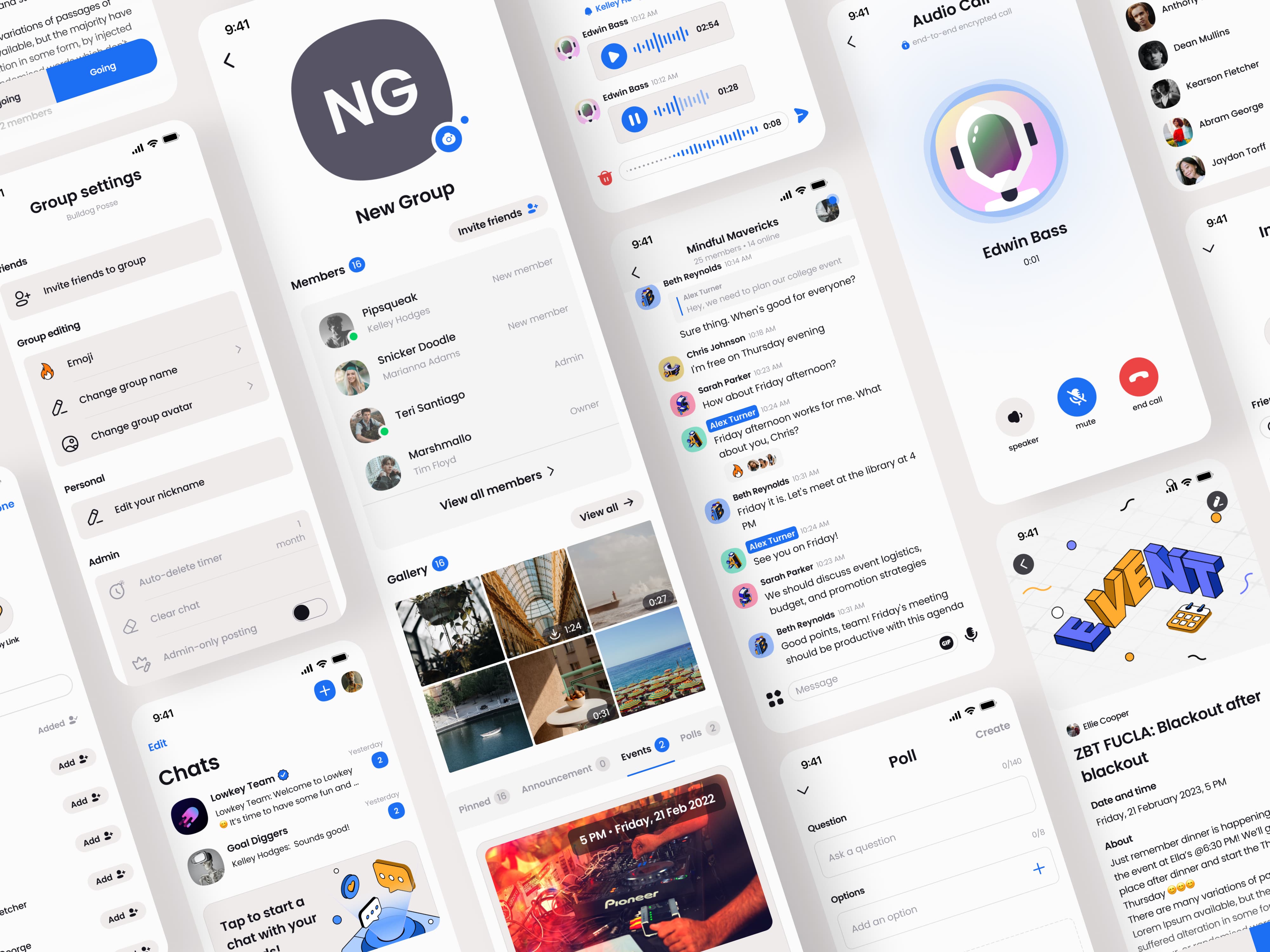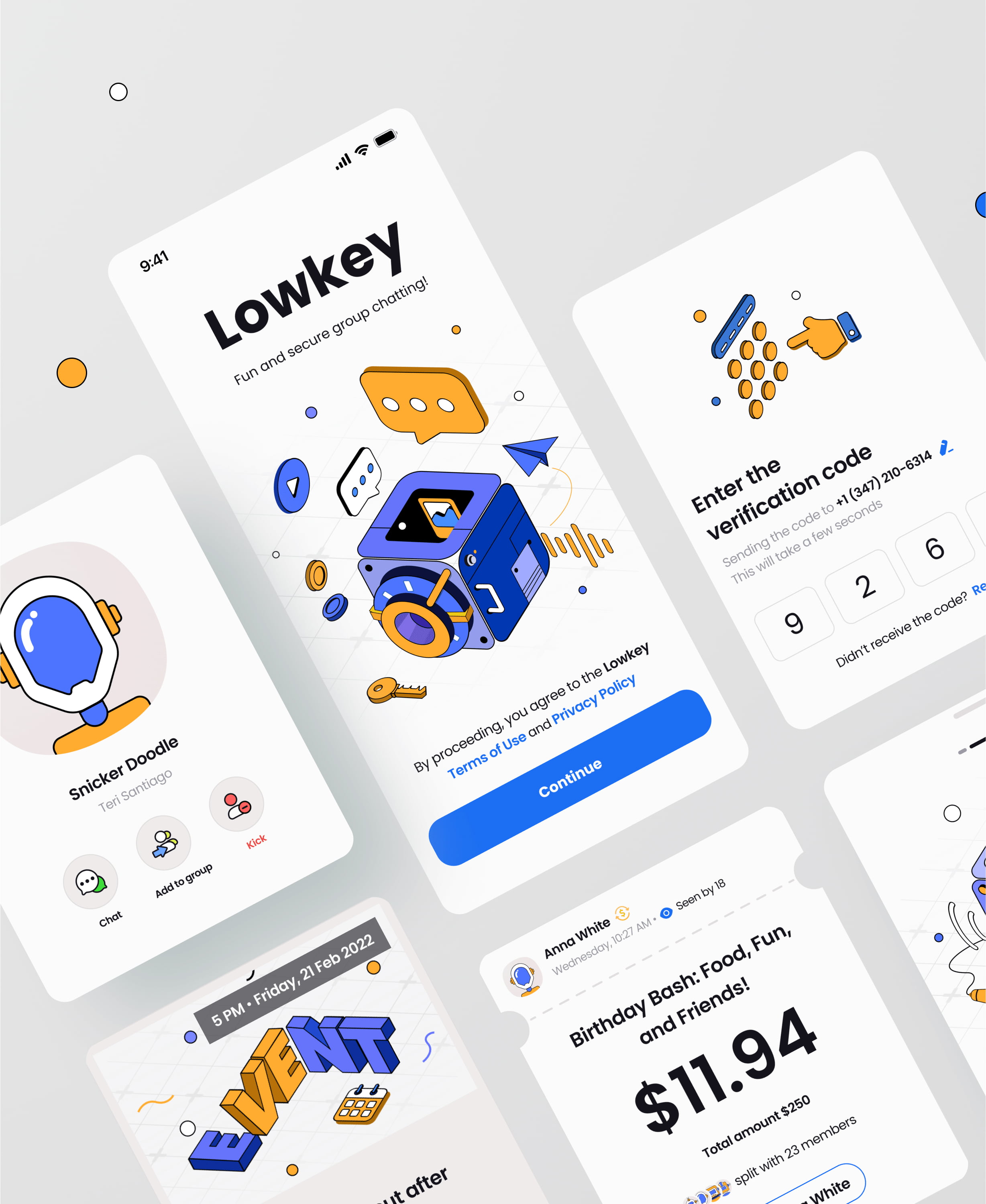
50+ screens
Organized components
White lable
UX complete
Mobile ready
Easily customizable

The design philosophy of this UI kit was to provide other designers with a 95% complete starting point. This means that we needed to create a robust design system with relatively generic styling, while still showcasing the unique features of each use case.
Show active conversations in the Channel List UI Component, including indicators of who has read the messages and any new messages received.
Threads keep conversations organized and on topic by displaying a parent message along with its list of replies, maintaining everything within a single threaded conversation.
Chat involves numerous micro-interactions, such as editing, deleting, flagging, muting, adding reactions, retrying, and initiating threads, all of which are linked to each individual message.
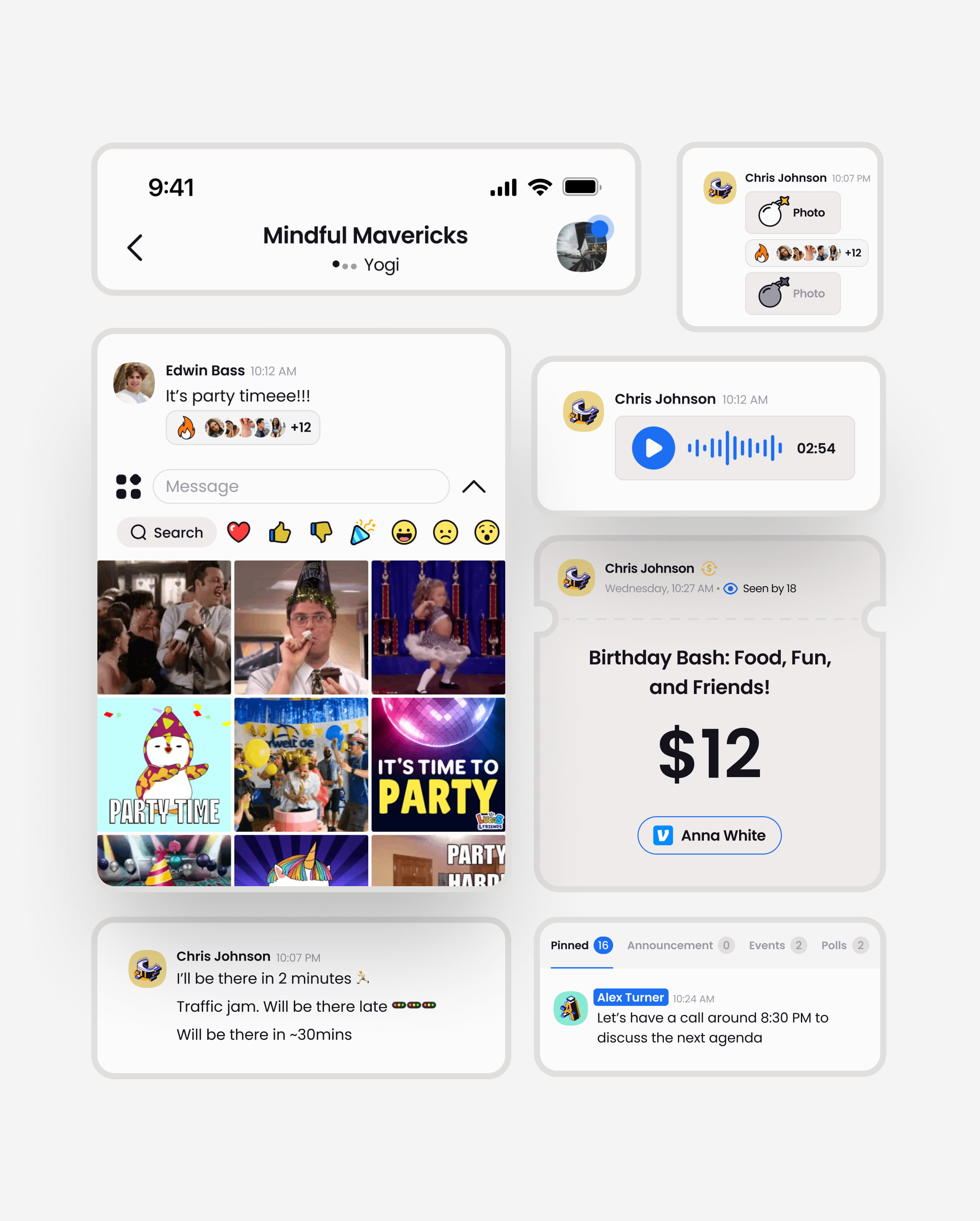
The message list UI features emojis, timestamps, and reactions. Ensure that the timing and user interactions for each message are accurate.
Choose and display an emoji reaction to a message. Reactions let users quickly respond to any message, serving various purposes.
Creating the ideal message relies on a dynamic and robust message input UI that enables users to attach images, videos, and files, and choose the right emoji.
We have designed options for DMs or Group chats. This includes how avatars are handled, chat preferences, and a whole bunch of other UX.
We've implemented design options for DMs and Group chats, including how avatars are managed, chat preferences, and various other UX features.
Featuring smart uploading, intelligent grouping, and robust gallery views, our Mobile Chat UI/UX is designed to seamlessly integrate and advance your design concepts.
ADDITIONAL FEATURES
Message Reactions
Link previews
Images, Videos and attachments
Edit and Delete message
Typing Indicators
Block & Mute
Image gallery
GIF support
Read Indicators
Light/Dark themes
Style customization
Simple UI
Threads
Slash commands
Network problems
Mention users
